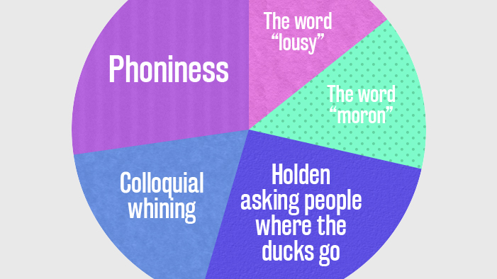


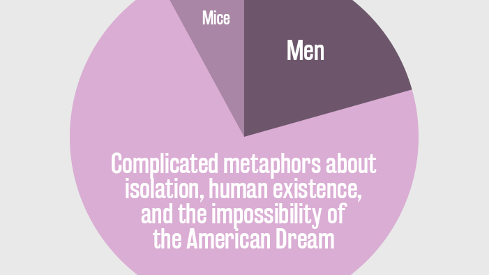
All the Books on Your English Syllabus Summed Up in Pie Charts
Here at SparkNotes, our stance on books has always been favorable. We like them. We think they’re great. We’re book lovers first, and human beings second. But this doesn’t change the fact that some books are long, unwieldy, and difficult to start (but easy to let languish unread in your backpack).
You know what makes things easier? Ignoring your responsibilities and just hoping it all works out, yes, but also pie charts. Pie charts make things easier. Everything seems less daunting in a brightly colored chart backed up by math. For instance, a pie chart of my life would indicate that I spend 20% of my time binge-watching reality cooking shows, 30% standing in someone’s way at the grocery store, and 50% switching between apps on my phone. Taken on its own, this information is both alarming and pathetic. Put it in a pie chart, however, and it’s not so bad. In fact, it’s downright delightful.
That’s no reason this same logic won’t also apply to books. That’s why we’re taking all the books you’ll have to suffer through this year and breaking them down with (EXTREMELY) scientific data.